User experience design: Rewards site
Project background:
Japan customer reward program. Participants completing a short survey and are rewarded with points for use in online shopping.
Opportunity:
I started with desktop research to understand Customer Experience (CX) improvement opportunities. Comparing a) survey completion data b) points redemption data c) opt in webpage data, I found that 7% of customers were completing survey, going to the website, but not claiming points. These customers would feel they were promised a reward, but would not actually get it, leading to poor CX. Additionally, I found that while on desktop the opt in button as visible, on mobile the button could be "below the fold" requiring users to scroll down to see it. I also found that this product measured CX before the points opt in, meaning that this problem could be excluded from existing metrics, and be a so called “time bomb” waiting to create a major problem if not addressed proactively.
Based on these findings, I hypothesized that the sites UX could be improved to partially address this "missed points" opportunity and improve CX for the product. I created lo-fi moc above ups incorporating the below changes, based on heuristics and internal team feedback, for stakeholder approval. After getting buy in, we then made the updates to the opt in site and monitored the “missed points” metric for a month to measure customer experience with the new designs.
Outcome:
XXXXX
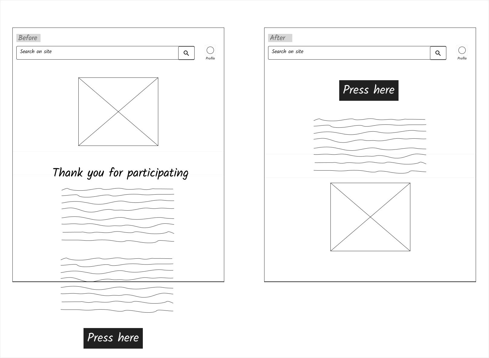
UX Changes:
Remove unneeded detail text in campaign description to remove clutter
Remove that thank you banner to reduce confusion on next action needed from customer
Moved points opt in button to top of page to draw users to required action
Updated opt in button text to be clearer on necessary action and align with similar campaigns in organization
Moved cute picture to bottom to reduce distraction but keep friendly vibe